Loman Street SE1 | commercial identity
Commercial redesign for a multi-let building beginning with site analysis and the challenge to make this property stand out in a crowded market.
Loman Street
Leighton Goldhill
Bermondsey SE1
Site analysis | Detail | Specification | Graphics | Lighting | Services coordination | Site supervision
Redesign of a south London multi-let building beginning with site analysis and condition survey: what’s working, what needs updating & crucially is there something that will make this property stand out in a crowded market?
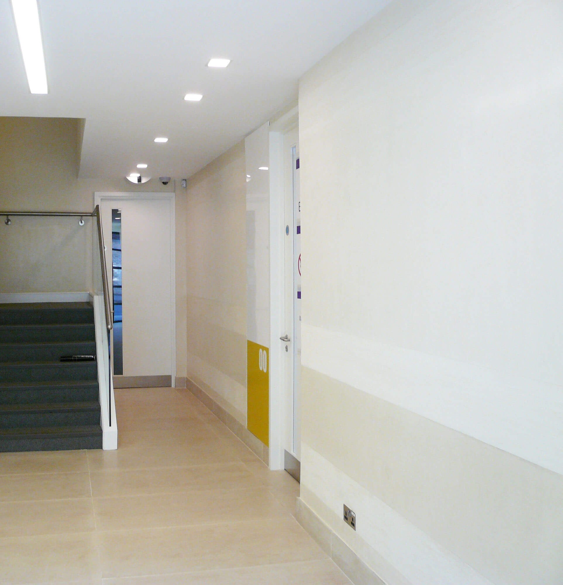
One easy answer is new energy-efficient lighting for the entrance, stairs and common parts for an instant refresh and longer-term benefit to the service charge. Polished plaster walls are retained, repaired and cleaned, and worn floor finishes replaced with practical, easy to keep, large format tiles.
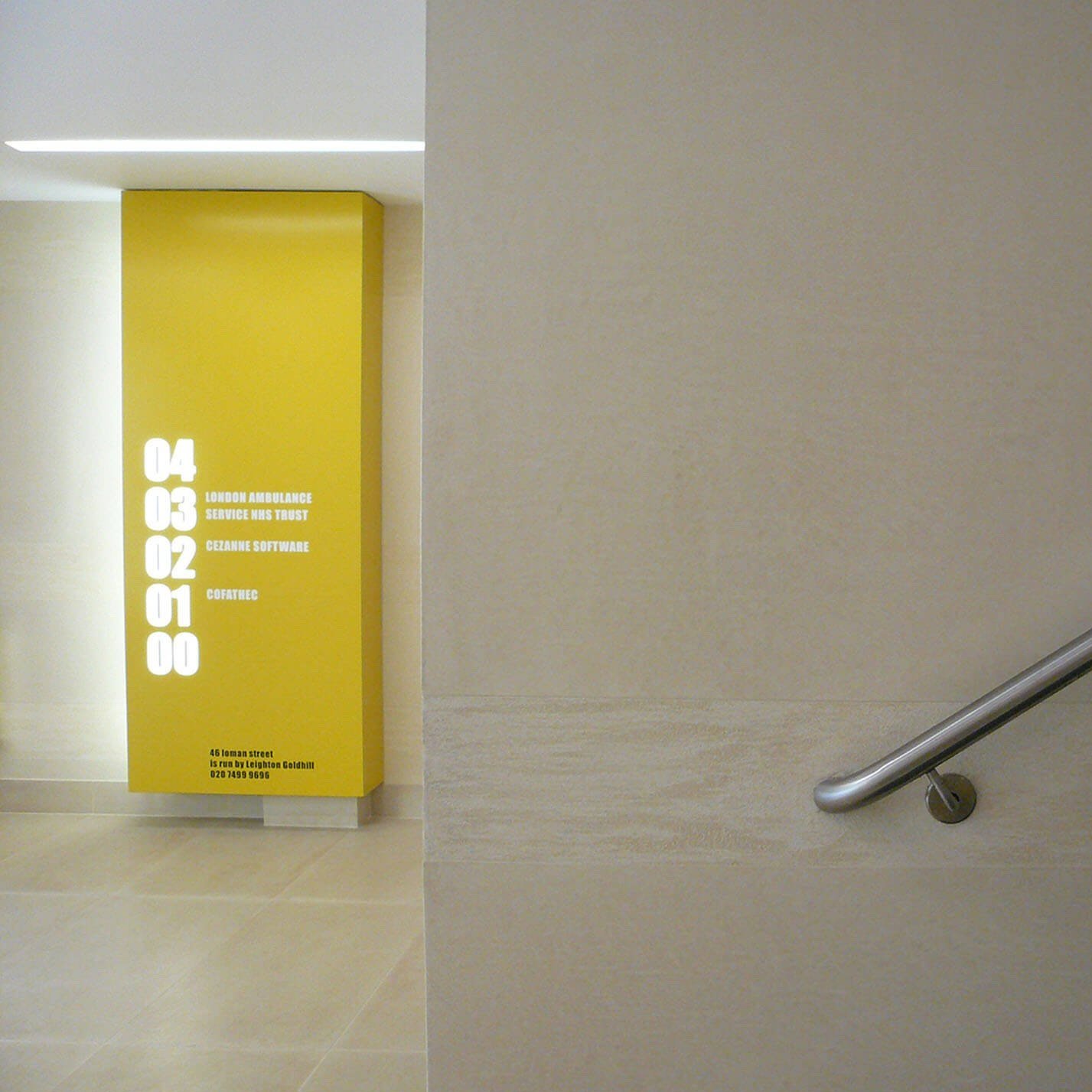
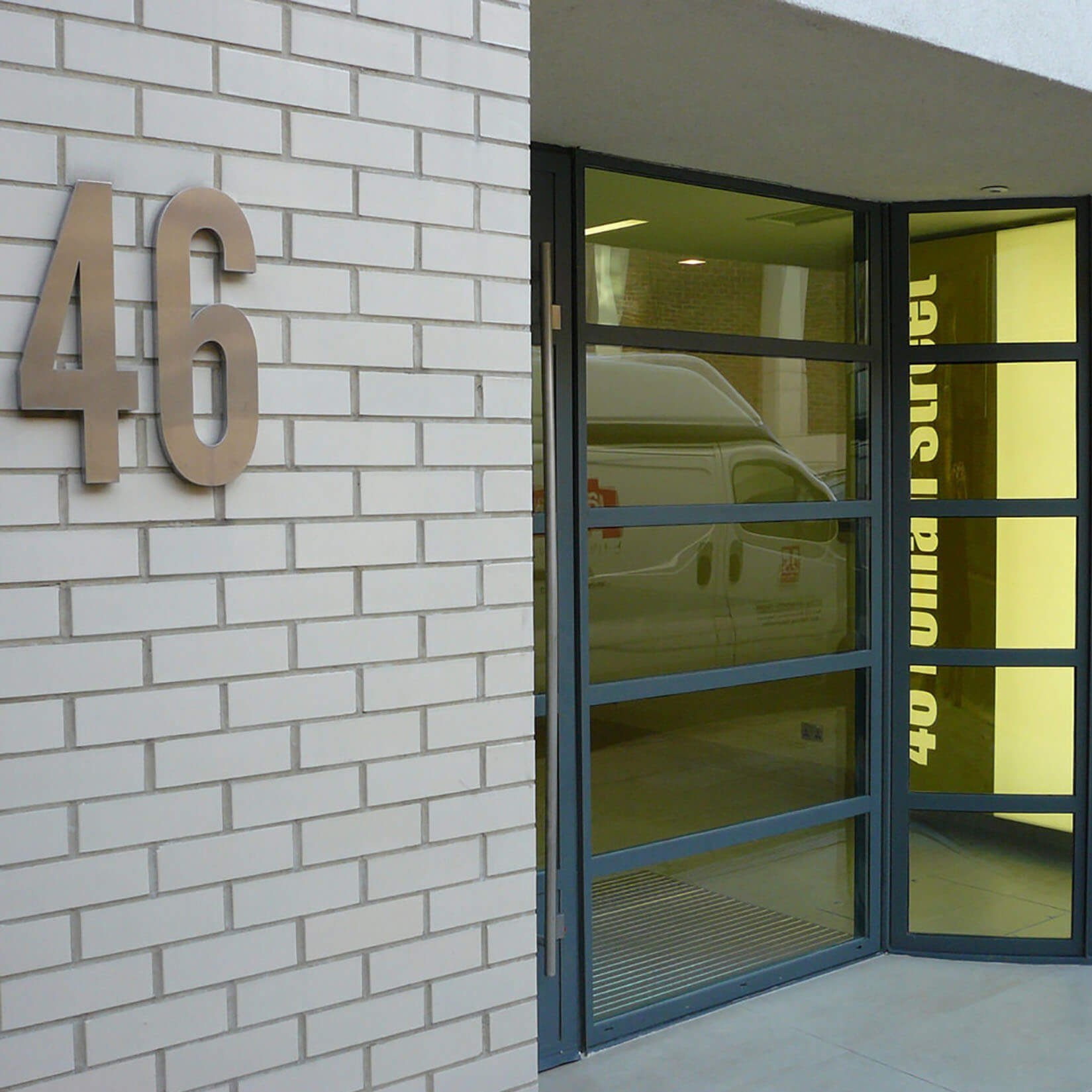
While these updates make for a cleaner, more contemporary look the major change is in the introduction of a strong graphic identity; the mustard yellow livery is used for internal way-finding and unit signs, and lobby light boxes which act as beacons along a quiet Bermondsey Street.
These simple measures set the building apart, and are an example of modest readjustments that are easily achieved and can make the difference between demolition and keeping an existing structure in use.
More work with Leighton Goldhill
The Medical Chambers GP Consulting Rooms
Maritime House Workspace


